Customer Case: Sportsdeal
The power of pricing visualization.
Pricing and perceived value is something that’s probably been on every e-commerce site’s agenda. How do we make the pricing of a product seem attractive? This is especially relevant when talking about reduced prices and how we can, through knowing some behavioral psychology, tweak the way we visualize the price and make the value be perceived as more attractive.
This Customer case will take you through an A/B test concerning reduced prices for a company called Sportsdeal. Sportsdeal is a Norweigan e-commerce company which mainly sells outdoor clothing and gear. One of their main USP’s is their pricing, they want to give their customers the best deals on the market.
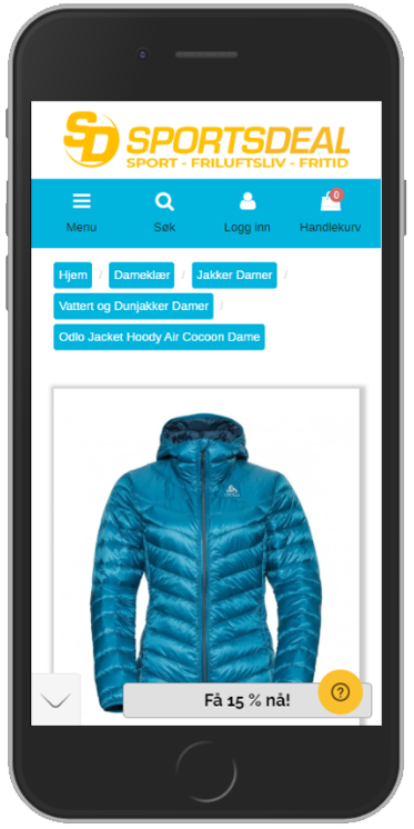
Because we know that the customers of Sportsdeal are very likely to be looking for reduced prices and making good deals, we can quickly deduce that the pricing and value of a product is important to the customer. So let’s go to a product page and look at what we have to work with and if there is anything we can do to tweak and increase the perceived value.


The problem
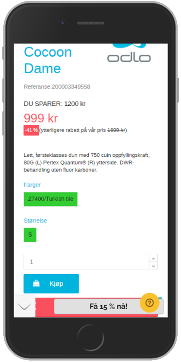
For those of you who do not speak or read norweigan I will explain what it is we can see. First off we have a text which says the amount saved on the pricing is at 1200 kr. Underneath that in red we have the now reduced price at 999 kr. And beneath that we can see a percentage written out at -41% and then a text written in parentheses which says “further discount on our price 1699 kr”. The actual discounted percentage is correct, but the thing which is confusing here is that it says the amount saved on the pricing is 1200 kr. And 1699 – 999 = 700, so how does that work?
Despite the fact that we now are confused by how that discount works, the way and order in which all of this information is displayed in, further contributes in making it very confusing to get a good sense of what value the reduction is giving us. We figured there had to be a better way of doing this.
The challenging variant
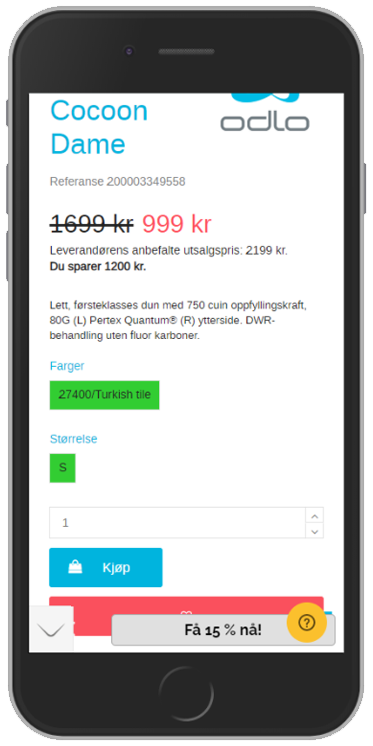
In looking through the page and figuring out what we could do, we noticed in the code that there was a “suggested retail pricing” which is what they use to figure out the amount saved on the discounted price. Knowing this, our challenging variant came out like this:


So we have now moved the original pricing to the left of the new pricing (shown in red). All nordic countries read from left to right, and this is something we can take advantage of in order to emphasize the value. If we put the original pricing to the left of the new price the perceived value will be higher than if it were the other way around. We then write out the suggested retail price and beneath this we show the amount you save on Sportsdeals pricing. So now we get a clearer picture of what the discount does for us and also how much we save by buying from Sportsdeal instead of another retailer which goes by the suggested retail price.
Now, to the fun part, the results!
Of course our primary KPI to look at in this test is Finished purchases, our hypothesis is that these changes will help increase the perceived value of the product and as such also increase motivation to finalize the purchase.
After around 30 days we saw an uplift for mobile users of 13%, statistically assured at 99%.
This means that in the variant we can see that 13% more are going through with their purchases than in the original. What an uplift, this proves that our hypothesis on value perception really made a difference. By just making some visual adjustments of how we present our pricing and discounts we can influence the value of a product. All without even touching the actual price and discounts of the products.
Do you want to learn how you can use A/B testing to increase conversion?


