
Customer Case: A Day’s March
The hidden power house of your website: On-site search.
On-site search is a must have for every e-commerce site nowadays. It is the go to for when your users can’t find what they’re looking for or if they need to find something specific, fast. Because searching users have a higher purchase intent they can convert up to 4-5x higher than your average non-searching users. On some sites we have even seen cases where the on-site search accounts for anything between 10% to 40% of all revenue. However a lot of e-commerce websites seldom pay much attention to their on-site search.
In this customer case we will present an A/B test we did with A Day’s March concerning their on-site search. Now, there are a lot of different aspects to an on-site search which you can, and should, analyze and optimize to your heart’s content. But this customer case looks specifically on how we can best present the on-site search in order to get users to interact with it to a higher extent.
A Day’s March is a Swedish clothing label founded in 2014 which sells wardrobe essentials and clean-cut basics of premium quality for affordable prices.
The most noticeable thing on A Day’s March website when we started our conversion analysis was that the on-site search only was available through the hamburger menu on mobile.
And while this can feel like a very clean and minimalistic way to design your website you are effectively eliminating one of the most crucial parts for a lot of customers.
The hypothesis is that by making the on-site search more available and prominent we can motivate more users to search. Searching users convert better than non-searching users which means that if we can encourage the use of search on the website we can increase the conversion rate. This inspired the following execution for our challenging variant in this A/B test.


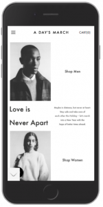
To the left we have a screenshot of the mobile website when the user is at the top of the page. The on-site search is here folded out in full width, still with a very minimalistic and clean look to match the design of the website. To the right we then have a screenshot of when you start scrolling on mobile, the search moves up into the header area and is visible as a search icon instead. This allows us to let the on-site search still be available even when our users are scrolling and looking through the different pages and products. So when the users feel like they’re maybe not finding exactly what they are looking for, they can turn to the on-site search and be more specific in what they want.
Our primary KPI’s for this test were:
- Clicks on search
- Finished purchases in combination with click on search
We let the A/B test run for about 30 days on every device. The results were amazing. We got 78% uplift in clicks on search. And we also saw a 70% uplift for finished purchases in combination with click on the search.
This shows us just how important, not only having an on-site search is, but also how crucial it is that we present it at the right places to make it more accessible for our users when they need it. The on-site search is a big deal, when users can’t find what they are looking for they will leave your site. So make sure you really and truly are working data-driven and start testing to find out the true potential of your website.
Do you want to learn how you can use A/B testing to increase conversion?

")
")

 1")