Customer Case: Gina Tricot
Gina Tricot: When the data speaks for itself
When you start A/B testing you quickly begin to see the importance of letting the actual data do the talking. You will learn that most of your ideas are probably going to have a negative impact. However A/B testing is first and foremost a way of learning, and it is through this learning process that you will begin to understand your users and their behavior on a completely different level. Every test is a learning experience and should be treated as such. In this customer case I will show you an example of one of those learning experiences.
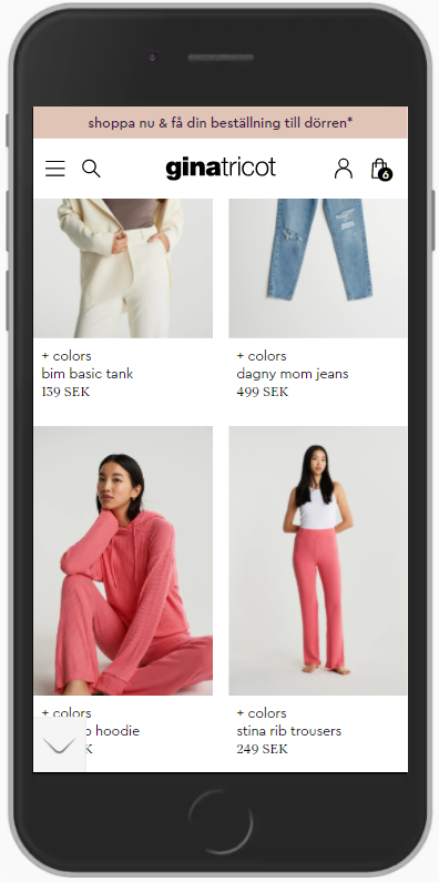
Gina Tricot is a Swedish clothing apparel shop selling all the latest trends within fashion. In another blog post that we’ve posted on here I wrote about the importance of on-site search and how it is often the hidden power-house of a website. So naturally we wanted to address this part of Gina Tricot’s website as well. When we started out the on-site search was presented like this:

And it looked the same on scroll and when you were at the top of the page as well. And this is a pretty standard execution for many websites. We often tend to gravitate towards more minimalistic executions because it looks good and we also don’t want to annoy the user too much. However, from A/B testing on a lot of different websites we at Symplify have found that because the on-site search is so important and well converting we can increase sales through emphasizing this element more and driving more traffic to it. So what we did was we folded out the search bar when the user was at the top of the page or when they scroll up, and when the user scrolls down the search is hidden. This way we keep a very minimalistic look but we get to direct more attention towards the on-site search which should increase interactions with it and in turn also the number of conversions.

In this A/B test we wanted to track the interaction with the search to see if it in fact increases when we emphasize the visual hierarchy of the element, and we also wanted to make sure that non-searching users weren’t annoyed by the new change.
What’s interesting is what we noticed after about 2 weeks into the test period. We noticed that we, in the variant, were seeing decreases in the amount of interactions with the search field. This was quite surprising as we almost always see an increase in interaction from emphasizing something. We decided to discuss and brainstorm a little bit around why this could be happening. The theory that we came up with was that because of the minimal distance between the hamburger menu icon and the search icon, users were in the original miss-clicking on the search icon. This would then mean that our variation completely avoids that issue and is why we then see a decrease in the number of clicks on the search field. So in order to confirm this new theory we set up a new complementary goal which would demand an actual search session in order to be triggered. Since Gina Tricot has a very good amount of users on their site we were able to very quickly gather some more data and see that we in fact are increasing the number of actual search sessions. This then confirmed our theory in full.
When the test was finished we ended up with the following results:
A decrease in the number of Clicks on the search
A 3% uplift in the number of actual search sessions, statistically satisfied.
As well as an uplift of around 2% for the total amount of finished purchases, also statistically satisfied.
So remember that just because you see conflicting results it doesn’t necessarily mean that your hypothesis is wrong. Start thinking about why it could be happening and see if any theories come up which you can validate with some complementary KPI’s. Let the data speak to you and you will learn something new.
Do you want to learn how you can use A/B testing to increase conversion?


