
Customer Case: Nordicfeel Pop-up
How we challenged Nordicfeel’s pop-up and increased sign-ups by 1000%.
E-commerce pop-ups are meant to grab the attention of the user, and (in most cases) deliver information or a promotional message. The purpose of a pop-up is to attract new leads and customers as well as motivate them to complete a purchase. However, pop-ups are more often than not seen as irritating and frustrating. They often appear when we’re not susceptible to what it offers and they then turn into a point of friction. This of course, is really bad for conversion.
But if we play our cards right and form our pop-up based on what a customer really wants and needs, the pop-up can help drive engagement and convince a potential customer to complete a purchase. In this Customer Case featuring Nordicfeel, we will show you how we challenged their pop-up and managed to increase sign-ups by 1000%.
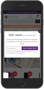
At the time, Nordicfeel’s pop-up looked like this:

Always when you’re optimizing there are some core things you should be keeping in mind.
- Relevancy – Is this relevant? Is this the right material being presented at the right time?
- Trust – Is the information trustworthy?
- Simplicity – How difficult is it going to be?
- Assurance – Is this the right choice for me?
- Value – What do I get out of this?
- Action – What’s the next step?
We can see that the original pop-up is quite big and takes up the majority of the screen space of a mobile phone. There is a picture taking up a third of the space of the pop-up and it doesn’t really add any value to the information. The copy is quite long and also repeats the offer twice. And to finish it off the submit button sends a discount code to your email, which means that the user has to leave the site and potentially wait a while for an email to arrive.
So how did we challenge this execution?
What we wanted to do was:
- Be direct with what the value is – we don’t read, we skim. Meaning that the important parts should be highlighted and easy to perceive.
- Make it simple, and show how simple it is.
- Set a delay for your popup so that the user has time to navigate before they are presented with the offer, ie. 2/3 pages in.
Based on this we produced this pop-up:
A clear headline with an emphasis on the value we want to communicate so that the user is instantly made aware of what they will receive. The copy is short and concise to move the focus to the other, more important parts. We clearly display where the email address goes and we also make it so that when you submit you are instantly presented with the discount code, no need to navigate to and from an email inbox. This is also very obviously shown by writing in the submit button “Show discount code”, so that the user knows that the code is just one click away.
Our primary KPI’s that we wanted to monitor in this A/B test were:
- Clicks on the submit button
- Finished purchases
After running the A/B test for 30 days the results were in. For Click on the submit button we saw an uplift of around 1000% for the challenging variant. At the same time we also saw a 2% uplift in Finished purchases for mobile users. And keep in mind that roughly 80% of the traffic here is mobile.
The campaign code showed in Google Analytics that the challenging variant gave around 55% more revenue than the original execution did from the discount code during the testing period.
In other words, a very successful result.
The variant was then immediately activated as a personalization for 100% of the traffic, meaning we let the variant run for all of the incoming traffic so that we would not have to wait for the in-house developers to implement the code on the website. By activating a variant as a personalization we can give the developers more time to implement the change without having to worry about losing revenue and other uplifts.
We now know that by presenting a more clean and focused pop-up with a simplified process for Nordicfeel’s users, we can motivate more users to not only submit their email addresses, but also motivate them to complete their purchases.
Do you want to learn how you can use A/B testing to increase conversion?

")
")

 1")